Now What?
What WAS that?
Sunday, January 22nd was a landmark in the history of this church -- a joyous culmination of our rebranding process which, in my 30 years as a public relations professional, is memorable as a uniquely congenial transition. God's hands were definitely in the work.
Wait...Why did we do that?
Rebranding can mean a lot of things, and sometimes churches resist the business-world implications of the words "brand" or "marketing," so let's just call it communicating. Can we all agree we need effective communications?
Think about coffee. How many different brands of coffee can you think of quickly? Folgers. Starbucks. Nescafe. Millstone. Taster’s Choice. Dunkin’ Donuts. Maxwell House… There are hundreds.
When you’re drinking a particularly good cup of coffee, don’t you want to know which one it is? In a media-saturated world, how does Maxwell House, for example, differentiate itself from other coffee companies?
Of course, They have a logo. Do you remember it? The coffee cup with a little bit of coffee dripping from the brim.
They use color. I bet you remember the color of the can… blue
They have a tag line… Good to the last drop.
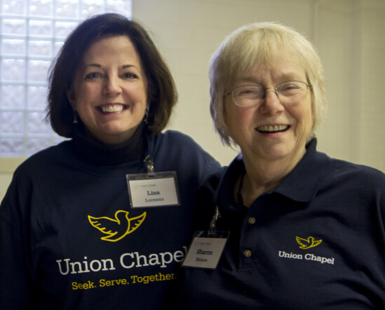
Effectively communicating who we are through a visual brand will help people in our community know … WHICH ONE of all the churches on 86th street we are. When they see our team volunteering at Nora Elementary, they’ll have a better chance of knowing where that good work is coming from if we've used our visual identity wisely (for example, on our business cards and t-shirts).
So... now what?
Great. Now that we've done months of soul-searching and strategizing and creative work... and we've identified the best visual representation of our congregation and the swankiest colors and the most accurate tagline for our church's mission...
The launch of this new brand is perfect for the season of ministry the church is in now. And of course, God's timing is perfect! This “rebranding” gives us a new opportunity to tell
What do you mean by, "communicate?"
Simply put, we ALWAYS communicate – everything from the healthy pride we have always taken in our beautiful building and grounds, right down to how we EACH talk to our own friends and family about the church. It’s all communication and it all has an impact of some sort.

Our new branded materials, used consistently, will strengthen those messages and make them more cohesive -- connecting the good work we do in the community to THIS church -- equipping you, the saints in the pews, to do effective communication on your Facebooks and Instagrams, in the grocery store, in your personal conversations… maybe at a Habitat for Humanity build … maybe at a baseball game. Now, you have the tools to INVITE others to be a part of this church’s story, in YOUR OWN WAY.
Great! My way looks like tie-dyes and butterflies.
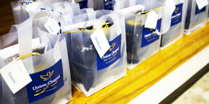
Ok, Hold on a sec. It’s pretty difficult to build brand recognition when your brand isn’t consistent. That’s why we’re going to be very intentional about using our new logo and brand colors on anything that connects to the church. That way, if someone stumbles upon a T-shirt worn in the community, a sticker, a grocery bag, or the church's Facebook page, they’ll be able to connect it back here.

As fun and exciting as these new tools are, those postcards and stickers and pens and t-shirts and such will not do their job by merely sitting on your kitchen counter. The most effective communicator for our church is sitting in YOUR seat. In the coming weeks, we’ll talk more about HOW to use our materials (and how not to) so that YOU can confidently go about doing the work we were ALL called to do: “To go and make disciples of all nations.” … we can begin with Nora.
Don’t worry. We’re all in this, TOGETHER.
-- Lisa Lorentz, Mission Communication Coordinator

Comments
Login/Register to leave a comment